Here is why: Data Studio is a real-time, interactive reporting tool that enables you to create dashboards with data from up to 12 sources (including Google Analytics, Google Ads, your Facebook page, Facebook Ads and much more). The platform makes data look beautiful, logical and helps you measure and analyse your growth.
To me, data studio is a time-saving, free data visualisation tool that every company should know about and use, every day.
Let’s have a better look at what it can do:
DATA STUDIO LINKS TOGETHER ALL OF YOUR DATA SOURCES
In previous articles we have talked about various data sources including:
- Google Analytics and Google Search Console in Next Level: Measure Your Digital Success Through Data
- Google Ads in How Google Ads Works: An Introduction
- Google My Business in How Google My Business Helps your Small Business
And as already mentioned, data from your social media accounts can also be included — (Facebook, Instagram, Youtube) or social media ads (Facebook/Instagram Ads).
You can display all of your data from these platforms into one Data Studio Dashboard, giving you a snapshot of your business’s online analytics. IT’S A GAME CHANGER!
Let’s have a look at what the tool looks like from the inside:

TAKE A LOOK INSIDE THIS DATA STUDIO EXAMPLE
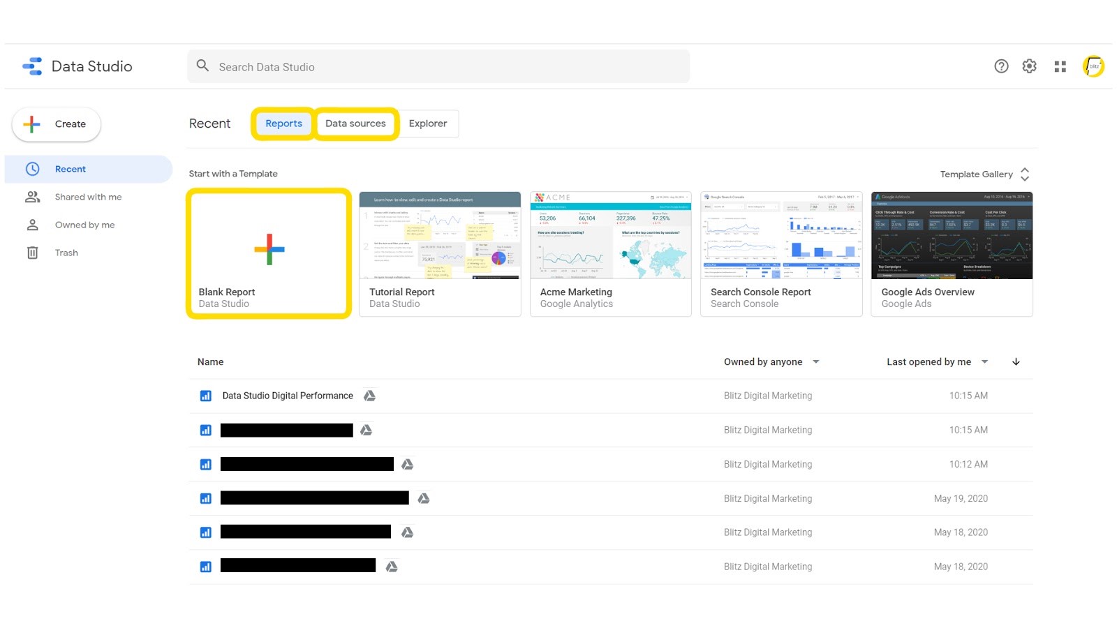
Once you have a Data Studio account, your main page looks like this:

There are two major components accessible from here. These are reports, and data sources:
- Under “Reports” you can create a blank report, use a report template, or view your current dashboards.
- Under “Data Sources” you can link sources to pull through your data from sites like Google Analytics. Google Data Studio has a helpful how to guide for learning how to connect data. See here: Connect to your data.
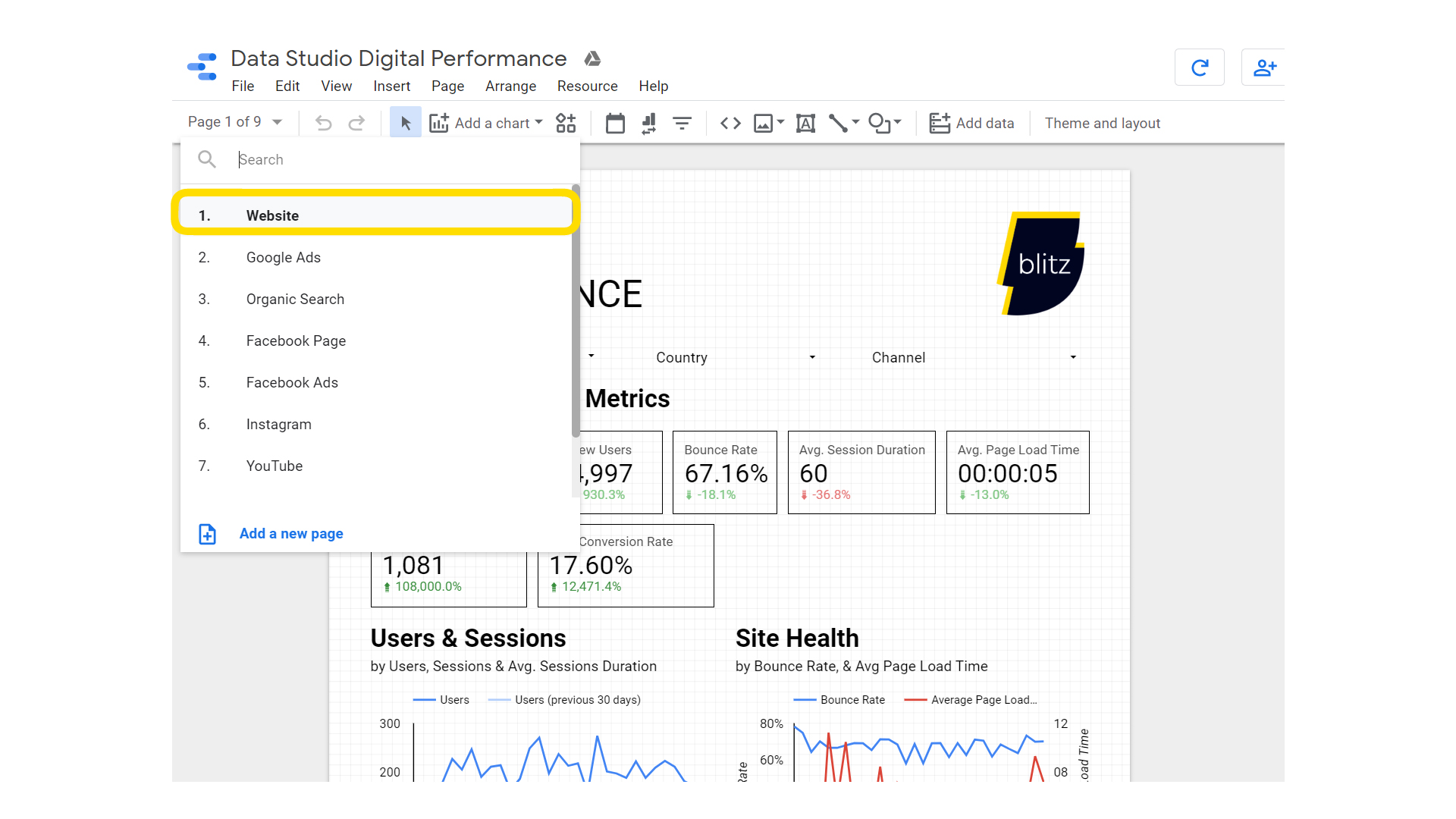
A report is most often composed of several pages. The format of these pages is up to you. We use a portrait format as it’s easy to view on mobile. Our report is made up of the following seven pages: Website, Google Ads, Organic search, Facebook Page, Facebook Ads, Instagram, and Youtube.

Let’s take a look at the first and most important page: “Website”.

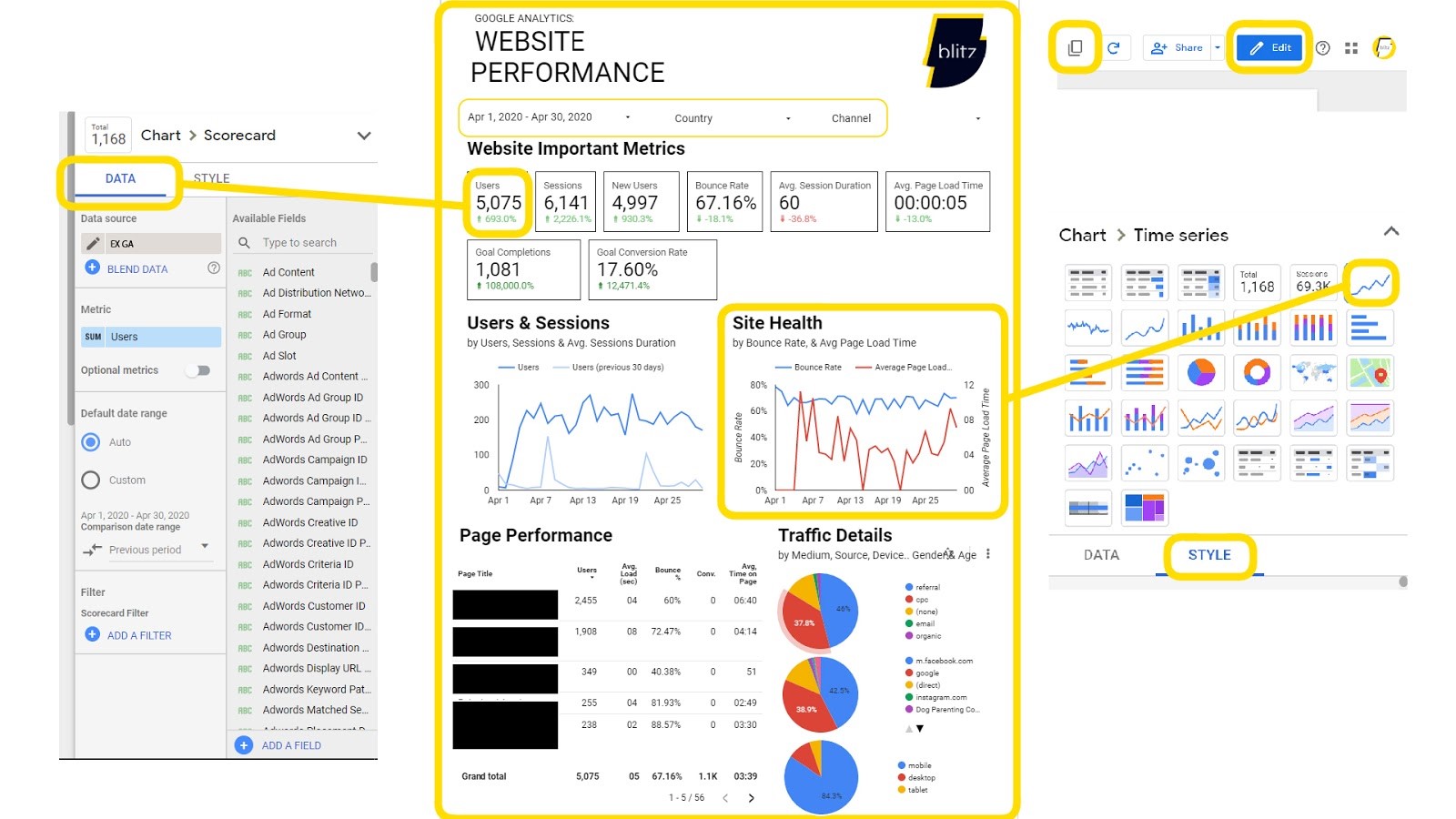
You can view your pages in two different modes: “view” and “edit”. The edit mode is where the magic happens. Here you can create your dashboard using graphs that are connected to your data sources. You can make a copy of the report, keep the same layout and attach different data sources. This is particularly handy if you have two distinct websites (example: you own one restaurant in Auckland and one in Wellington and you want to view their analytics individually.
By clicking on one of the fields in edit mode you will be able to modify the data source in “data” (see to the left of the page in the picture above) and the design in “style” (see to the right of the same page).
Choose your data metrics from a list: this is the information you want to display in the report. The data will appear for the time range you have chosen. You can even compare periods. We often compare a month of data to the previous month, and year on year data to get a full picture of company trends and growth.
For a complete guide on how to build a dashboard with Google Data Studio, have a look here.
TIPS FOR GOOGLE DATA STUDIO BEGINNERS
Before you start your Google Data Studio journey:
- Think about what you want to measure before you start. Which metrics are important for measuring the success of your business on different platforms? (It’s better to have too much data than not enough. Data can surprise you and is a great tool for making informed adjustments).
- It is important the dashboard is easy to read and well organised. Make it beautiful! There are many different ways in which you could design the layout of your Dashboard! This gives you the opportunity to adjust it to your brand image. Discover some of the options here (thanks MeasureSchool).
- Double check if the displayed data for the chosen time range in Data Studio is exactly the same as in the report parts of the Data Sources (Google Analytics, Google Ads etc.).
I am thrilled to know that from now on I know a free way to report all of my data in one place and make it look beautiful. It’s the best way to visualise and decode the data to reveal it’s secrets.
Get in touch if you are interested in having a bespoke dashboard to help you make smart business decisions.